Automated Customer Acquisition Funnel and Revenue Reporting
in G Sheets for Outbound, Inbound, & Events.

Problem
We tended to view whether we had a good month or not on the customer acquisition (CA) side based purely on how much healthy open pipeline we had at the end of the month and how much revenue from new logos was generated. We didn’t really review (or set goals to) all the metrics in the funnel, such as leads, MQLs, booked meetings, opportunities, pipeline, disqualified, no show, closed-won, etc and broken down by the three major CA functions: inbound, outbound, and events.
This made it difficult to set goals and forecast, and know by mid month what we were trending to.
Solution
The solution was to build a spreadsheet that recorded each stage of the funnel for each CA function in both a point-in-time and a cohort view all updated automatically. With all the numbers available in one view, it became much easier to see how well each function of CA performed compared to previous months, spot low converting stages in our funnel, and find new opportunities to grow.
Part I — Data Cleanliness in Salesforce
Step 1 — Documenting Processes for Opportunities
Most of the data needed to make this dashboard would be from the Opportunity (Opp) object in Salesforce (SFDC). We needed to enforce through documented processes when sales reps should be creating Opps (and when they shouldn’t), how to properly update Opps, and build in rules to make certain fields required depending on the Opp stage.
Step 2 — Redefining Sales Funnel Stages
We started out with a very simple sales funnel: leads > opportunities > close. We added an additional stage between leads and opportunities we called ‘Booked Meeting,’ which signified that the initial discovery call/demo was booked by a sales rep and is scheduled to run, but hasn’t yet. This is the first stage on the Opp we called ‘Demo.’ Even though it was an Opp object, we didn’t call it a true opportunity because the prospect could still no show or be disqualified.
This now meant when something was an opportunity, it means the prospect is qualified and had a successful discovery call/demo. Plus, the conversion rate of opportunity to closed-won/lost was now a much better indicator for an AE’s performance.
Step 3— Creating Point-in-Time Stage Change Dates
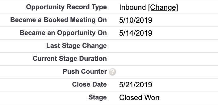
By default, SFDC records the Opp creation date and close date, but this limits our flexibility and reporting options. We created a few process builders to record the Opp creation date into a separate field on the Opp called ‘Became a Booked Meeting On,’ which allowed us to change it if needed. Once an Opp moved from the initial stage of ‘Demo’ to a positive next stage, we time stamped the date to a field called “Became an Opportunity On.”

Part II — Building the Dashboard
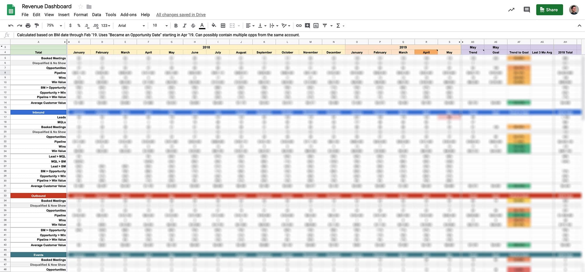
Now that we have good data on our Opp objects, I built dashboards in a Google Sheet to measure CA performance both by point-in-time (what happened during this month) and cohort (what happened to Opps created during this month).
Step 1 — Automating Data Into Google Sheets
Using a tool called G-Connector, we were able to login to SFDC from a Google Sheet, find our Opp report, and schedule a daily import into a separate tab in the spreadsheet. I scheduled it to update once a night.
Step 2 — Building the Point-In-Time Dashboard
Once the data is in the spreadsheet, building the layout of the spreadsheet and adding the formulas were pretty straightforward. On the point-in-tab view, I created a simple linear trend to predict where we’d be at the end of the month if our current pace continued then compared that trend tour goals. With visual formatting, this helped show where we need to pick up the pace at any given time.
Here’s the point-in-time view:

Step 3 — Building the Cohort View
For the most part, the cohort view is the same as the point-in-time view, but instead of using our new ‘Became an Opportunity On’ and close date fields, we stuck with the our new ‘Became a Booked Meeting On’ field throughout the funnel. So this view would answer questions like, “of all the booked meetings generated in April 2019, how much pipeline and revenue did we generate from them?”
Result
Now that the dashboard is complete and auto updating everyday, we have a very concise, high-level view of how each CA function is doing. Here’s three example scenarios our new revenue dashboard helped us understand instantly:
- When revenue is down one month, why? We can check which CA function (inbound, outbound, events) had low revenue and find out answer there. Or perhaps it was down across the board, and we can see that our AE conversion rates are down. We could then implement extra training to help address this issue and get feedback from the AEs about what supporting collateral they could use to help close more deals.
- Pipeline from inbound was low one month, why? Since leads and booked meetings are the direct driver of pipeline for inbound, we can check whether booked meetings were down and if leads were down. If leads weren’t down, perhaps it was a lead quality issue we could look into. If leads were down, we could look at our marketing dashboard to see which channels were down.
- We’re trending 10% above our pipeline goal this month, what’s happening? By pulling in the current month’s goal numbers from our plan and forecast, we could see how well we’re doing compared to goal. This could be answered by looking at which function is over achieving on pipeline generation and figure out why from there.
