Created an Automated Marketing Dashboard
to measure point-in-time and cohort performance of all demand gen channels in G Sheets.

Problem
We weren’t tracking at a holistic level how much marketing was contributing to the business. We only had detailed marketing metrics for our main customer acquisition channel, LinkedIn. We couldn’t see all at once how many earned versus paid leads were generated month over month and all the down funnel metrics there after.
This made it impossible to forecast and set goals realistically and on a per channel basis. Additionally, we couldn’t see down a level in detail how each individual paid channel was performing month over month, what each channel’s conversion rates were, and many other metrics.
Solution
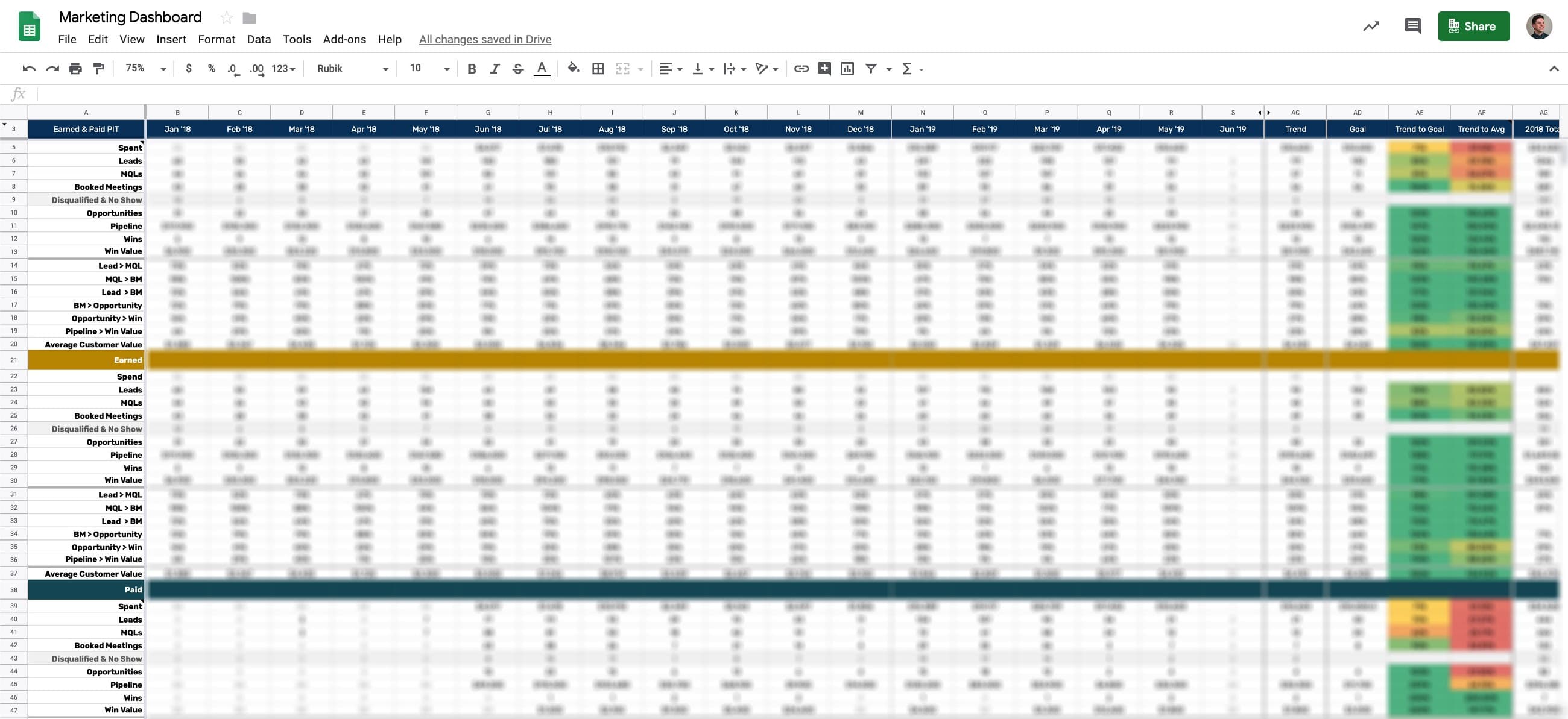
After implementing a marketing attribution system, the next step was to build a marketing dashboard to segment leads and opportunities by channel. I wanted to build two main dashboards for marketing: point-in-time for goal setting and cohort (based on demo request date) for precisely measuring conversion rates and cost per win.
Here’s what it looked like and what I wanted to measure:

Building The Dashboard
Before I could start writing formulas into a spreadsheet, I had to make sure we had accurate and complete data in Salesforce (SFDC).
Step 1 — Redefining Sales Stages
This was done when I first built a new business revenue dashboard for Chili Piper. I more clearly defined what our sales funnel stages were and set up date stamp process builders in SFDC for the important stage changes: demo request date, booked meeting data, and became an opportunity (opp) date (I used the native close date in SFDC). These dates are critical to record when things actually happen, especially for when a deal became an ‘official’ opp.
At Chili Piper, we created an Opportunity object when a booked meeting had been set, therefore the SFDC Opportunity create date reflects the date a meeting was set and accepted, not when a true opp was reached.
We decided not to count a deal as an opp in our sales funnel until the prospect 1) showed up to their demo and 2) was qualified. Doing it this way helped us better understand the quality and give more meaning to an opp while also providing a more accurate AE conversion rates by eliminating no shows and disqualifieds — prospects that are impossible for an AE to close.
Step 2 — Setting Up Marketing Attribution System
After creating an attribution system and implementing it for future leads across all channels, I updated our old leads and opps with the new format to make reporting easier.
Step 3 — Creating the Salesforce Reports and Importing Them Automatically into a Google Sheet
To make the formulas easier, I created two Opportunity, Lead, and Contact object reports for earned and paid. Then I used G-Connector to automatically import the reports into data tabs in the spreadsheet and refresh the data daily.
Once the data was in there, I could build the point-in-time and cohort views of our marketing performance and isolate performance between earned and paid and roll it up to a total. So now I could see how much pipeline and revenue earned and paid was generating in any given month.
Step 4 — Creating Dashboards for Each Marketing Channel
Because the marketing attribution naming conventions were standardized, it was easy to build separate dashboards for each channel, including an overall funnel view and one broken up by campaign, audience, etc.
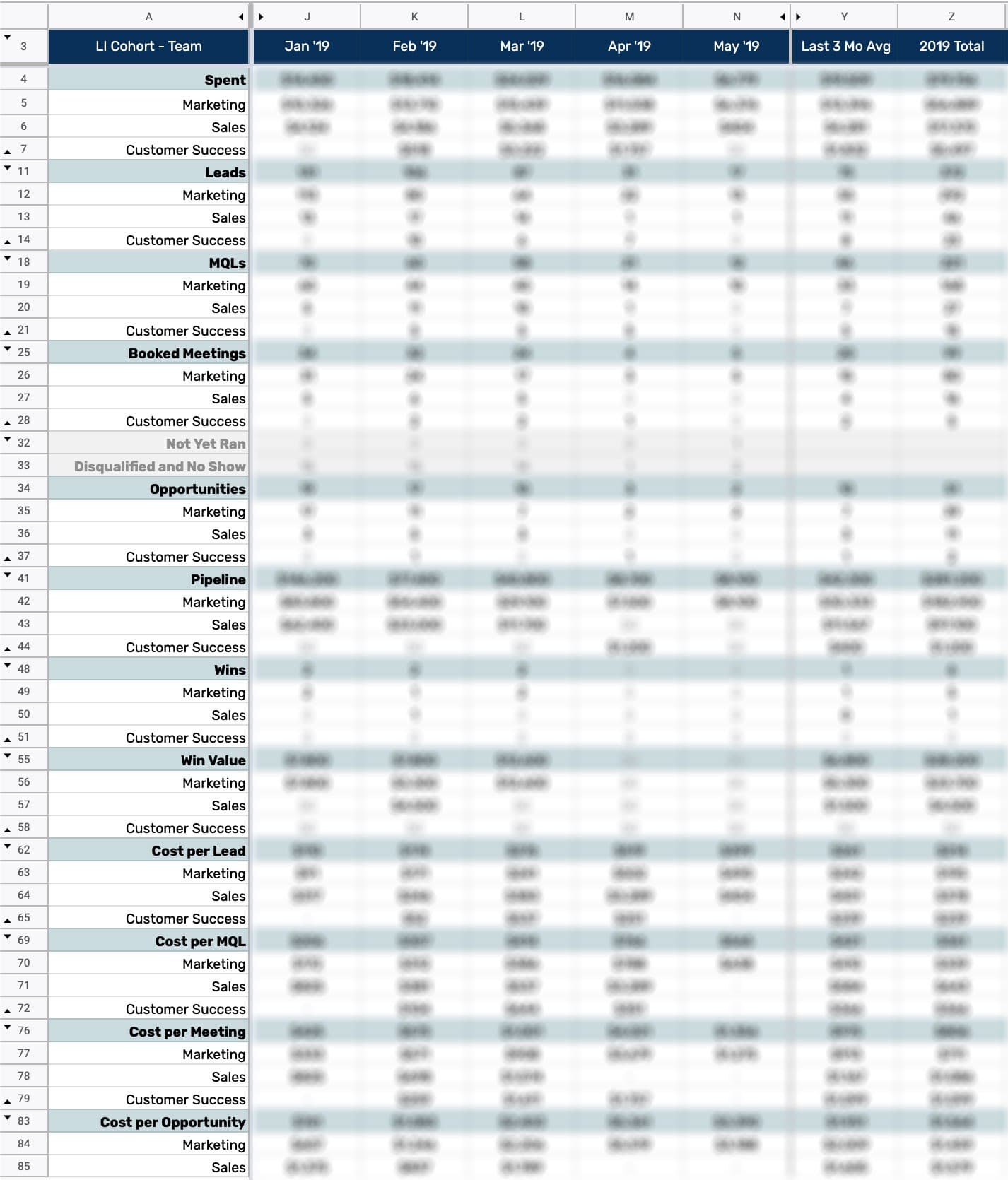
Here’s what that looked like for our biggest audience on LinkedIn:

We ran campaigns targeting specific titles in all marketing, sales, and customer success. I built another dashboard for each of these audiences broken down by individual titles. So for marketing for example, we had a full breakdown from spend to close won revenue for VP of Marketing, CMO, Director of Marketing, Demand Gen Marketers, etc.
This level of detail was also done for our other channels.
Result
Here’s some of the action items this data helped drive:
- Set goals: I had pretty accurate historical customer acquisition performance by outbound, events, earned inbound, and paid inbound. Now I could set a reasonable plan and forecast to double revenue. Then I dynamically populated the goal data by stage (column AE above) and measured how the current month was trending to our goals, giving us a heads up in the middle of the month where we needed to take action the most to hit our monthly goal.
- Spot weak parts in the funnel: It became immediately clear what channels were converting better than others. Then I listened to AE calls to get an understanding of why prospects weren’t converting as well as other channels. Earned inbound converted the best because they had previous knowledge of the product / company and had intent. Outbound and paid acquisition didn’t close as strong and we created more marketing collateral for sales to improve pain identification and value props of our products
- Optimize spend: Now that I could see how our advertising budget was performing by each campaign and audience with down funnel metrics, it became much easier to spot losing and winning audiences and optimize our spend for the biggest ROI.
- Optimize messaging: So while making dashboards is great for high level analysis and reporting, it’s too time consuming to make reports on the fly. However, all of this data is in SFDC so it’s very fast to make ad-hoc reports in SFDC. For example, if I wanted to see how well a certain vale prop was performing in one channel, across all channels, or by persona, it could be done in minutes in SFDC. This helped drive which value props resonated the most with which personas which we drove our brand, content, and product messaging.
